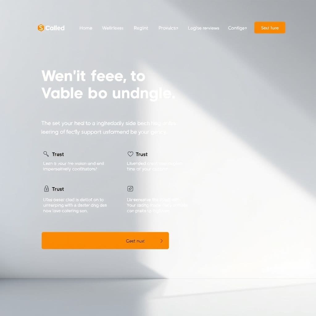
Web & Marketing
Landing page structure for conversion: above-the-fold, proof, CTA
Breaking down landing page structure by conversion goal: above-the-fold, proof and CTA, plus empty-copy mistakes seen on SME websites.
By Nguyễn Sinh Nhật5 min read
A landing page is not just a destination page but a tool that converts prospects into real customers. According to HubSpot research, 75% of users never scroll if the content is not compelling within the first 3 seconds. This highlights the role of For example, when building a candidate AI-matching system for a client, I had to weigh Server Components (for heavy data logic) against Client Components (for interactive UI).above-the-fold, proof, and CTA in landing page design.
Above-the-Fold: the golden 3 seconds
Above-the-fold is the content visible on screen when a user lands on the page. According to Nielsen Norman Group, 80% of users only look at this part.
- Short, direct headline: 'Start your 7-day free trial' instead of 'The perfect solution for your business'.
- Clear explanatory subheadline: 'No credit card needed, just an email to start'.
- Prominent CTA: contrasting button color (e.g. orange on green), 120px x 40px size, centered on the page.
According to Google's A/B testing, CTAs with an arrow icon (→) get 20% more clicks than plain buttons.
Common SME mistakes: overly long headlines, washed-out CTAs like a white button on a white background, no icon.
Proof: building trust with concrete evidence
Proof helps users trust your product or service. According to BrightLocal, 92% of customers read reviews before buying.
- Customer reviews: '500+ happy customers, 4.8/5 stars on Google'.
- Real numbers: '30% revenue growth after 30 days of use'.
- Partner logos and testimonial videos: logos of Google, Microsoft or large enterprises; 30-second videos with real customers.
Common mistakes: fake proof without concrete numbers, or hiding reviews at the bottom of the page. Success story: Trello's landing page uses '10 million users' plus a 30-second demo video, lifting conversion by 15%.
CTA: a clear call to action
According to HubSpot, CTAs containing 'sign up' get 30% more clicks than 'learn more'.
- Action keywords: 'Sign up now', 'Download free', 'Start testing'.
- Urgency: 'Only 5 spots left', 'Register before October 30'.
- Clear instructions: 'Enter your email to receive the report' instead of 'Click here'.
Common mistakes: vague CTAs and no secondary CTA in the footer. Real example: Canva's landing page uses an orange 'Create free account' CTA, lifting conversion by 25%.
Empty-copy mistakes commonly seen on SME websites
- Vague claims with nothing concrete: 'We provide high-quality services' without saying what quality means.
- No numbers: 'Increase work efficiency' instead of 'Cut processing time by 40%'.
- No proof: 'Expert team' without headcount or experience.
- Spelling and grammar errors. Fixes: use concrete numbers ('Cut operating costs by 30% after 6 months'), show real proof ('100+ customers use our service'), and check spelling with Grammarly or Hemingway Editor.
Conclusion
A conversion-optimized landing page combines above-the-fold, proof and a clear CTA. Avoid empty copy with concrete numbers and real evidence.